Lookbooks
Invites
Merchandising
Creating the ASDA George Home Lookbook in Spring Summer and Autumn Winter every year has become a regular project for CODA. Its a project that we look forward each season and each Lookbook is a chance for us to flex our creative muscles. The brief is to come up with a new and exciting way of showcasing the new seasons product ranges and create show stopping impact for the new ranges ASDA and the George brand are launching.
We are always keen to explore the use of interesting papers, finishing techniques, unusual binding and print or inks to create a different look and feel from the season before. This technique keeps each Lookbook different and fresh whilst also having the ability to dovetail in to the overall theme for the PR Launch events in London.
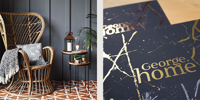
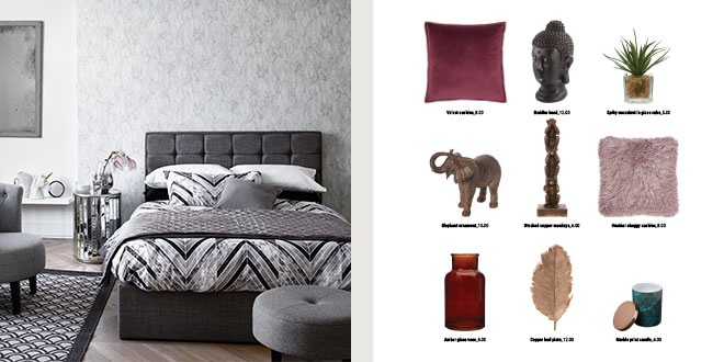
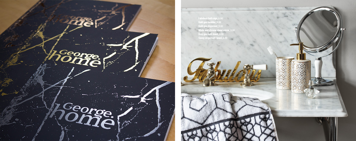
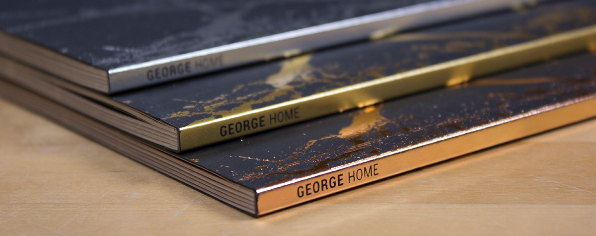
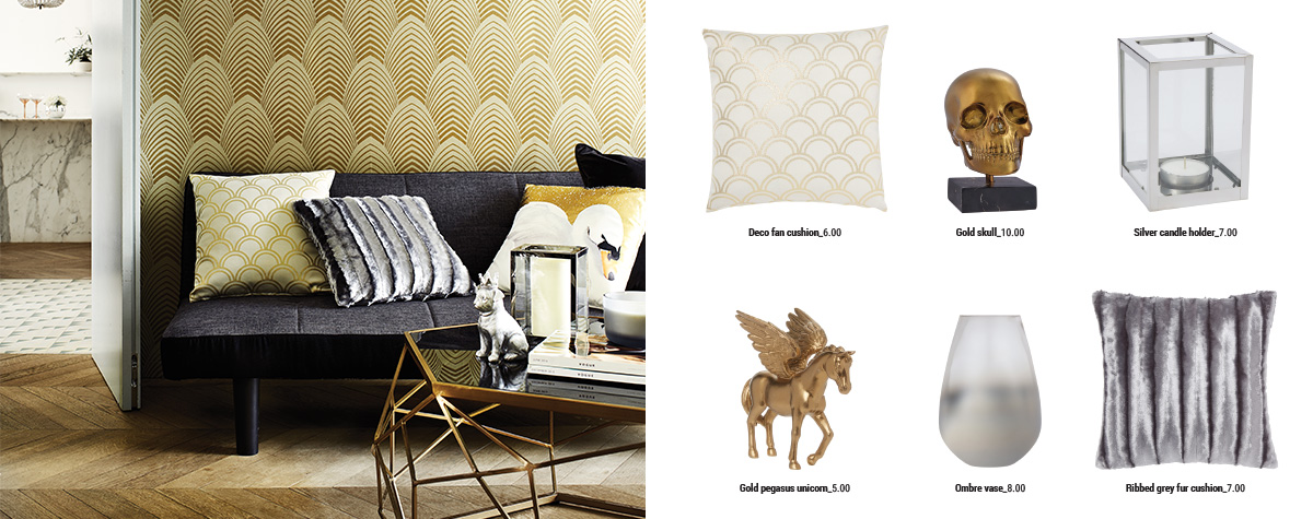
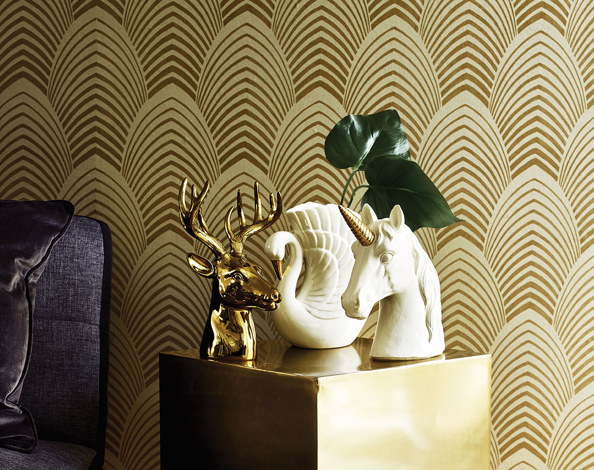
The ASDA George Home Lookbook AW17 season consisted of 5 ranges all with bold textures, metallics, marble and graphic prints included throughout the ranges. We wanted to create something striking that would stand out from the previous years design so instead of using a full size hero image as the cover, we chose a more graphical approach. We used a marble texture for the cover with 3 different foil finishes in Gold, Silver and Copper, this foil was then applied onto ‘Plike Black’ GF Smith paper stock. GF Smith Plike is a very unusual tactile paper that has an extremely flat matt jet black finish. The three metallic foil finishes were a way of showing off the copper, silver and gold themes from the ranges and also allowed the people attending the event to choose their preferred colour of Lookbook.
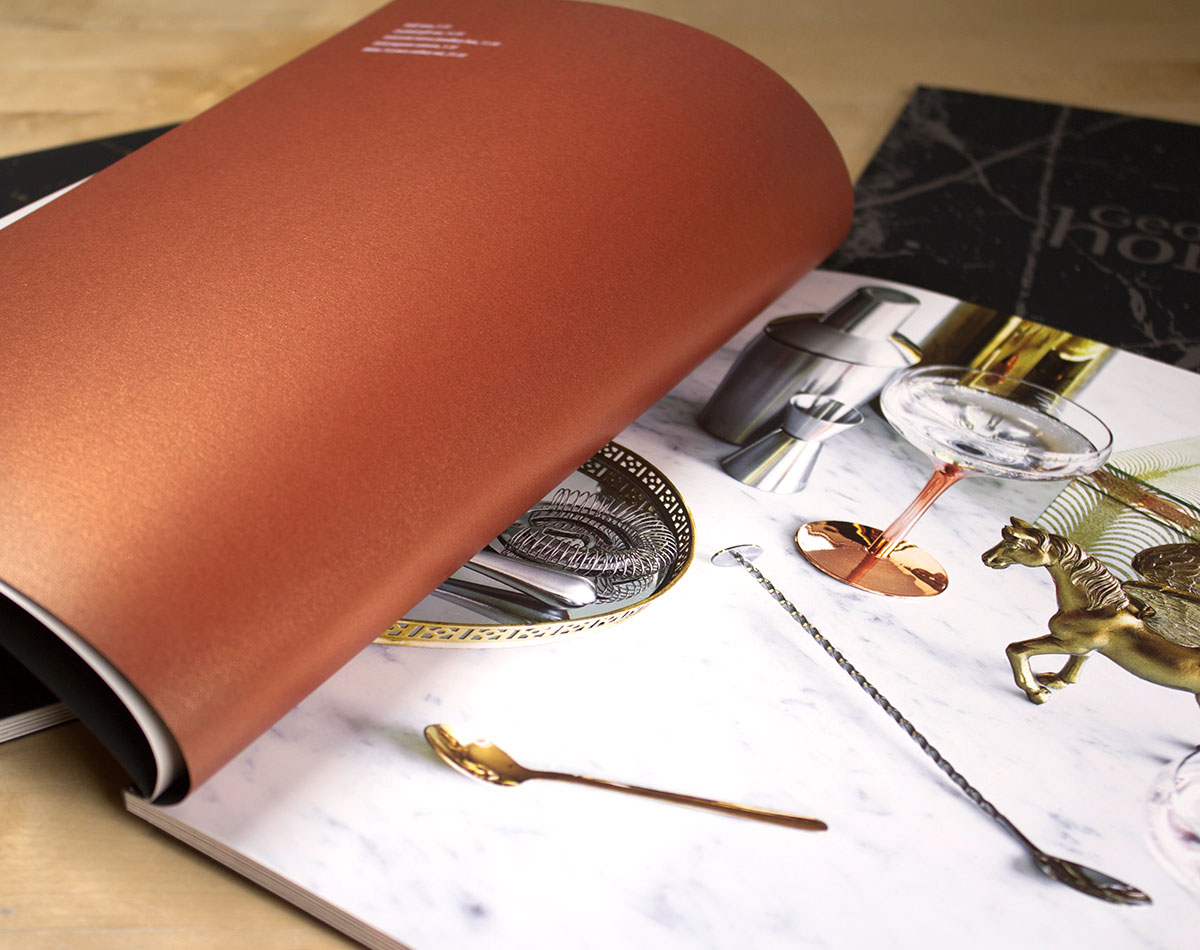
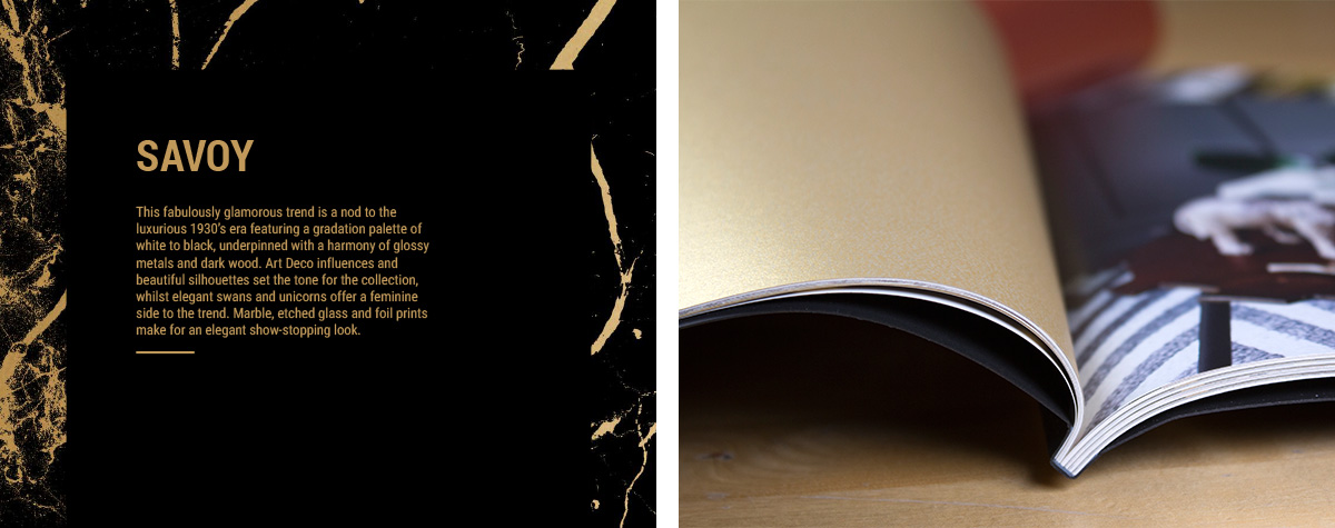
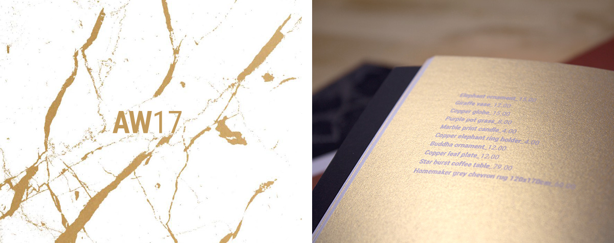
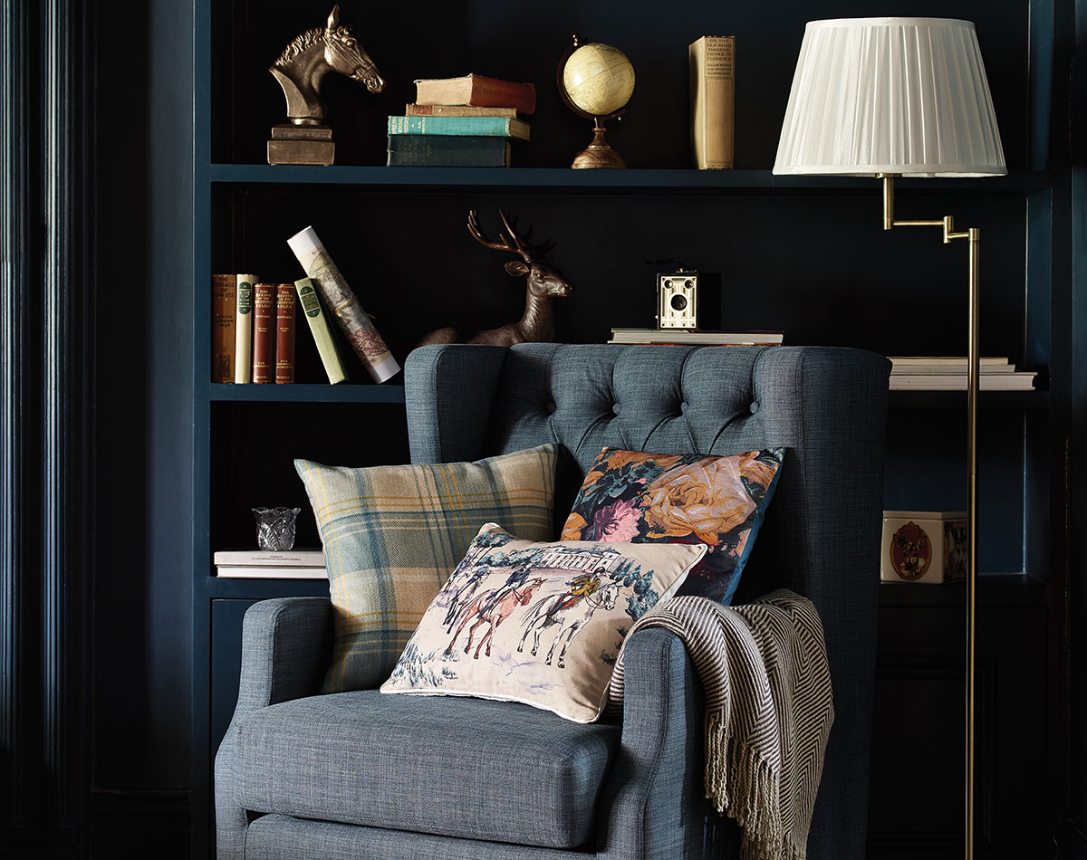
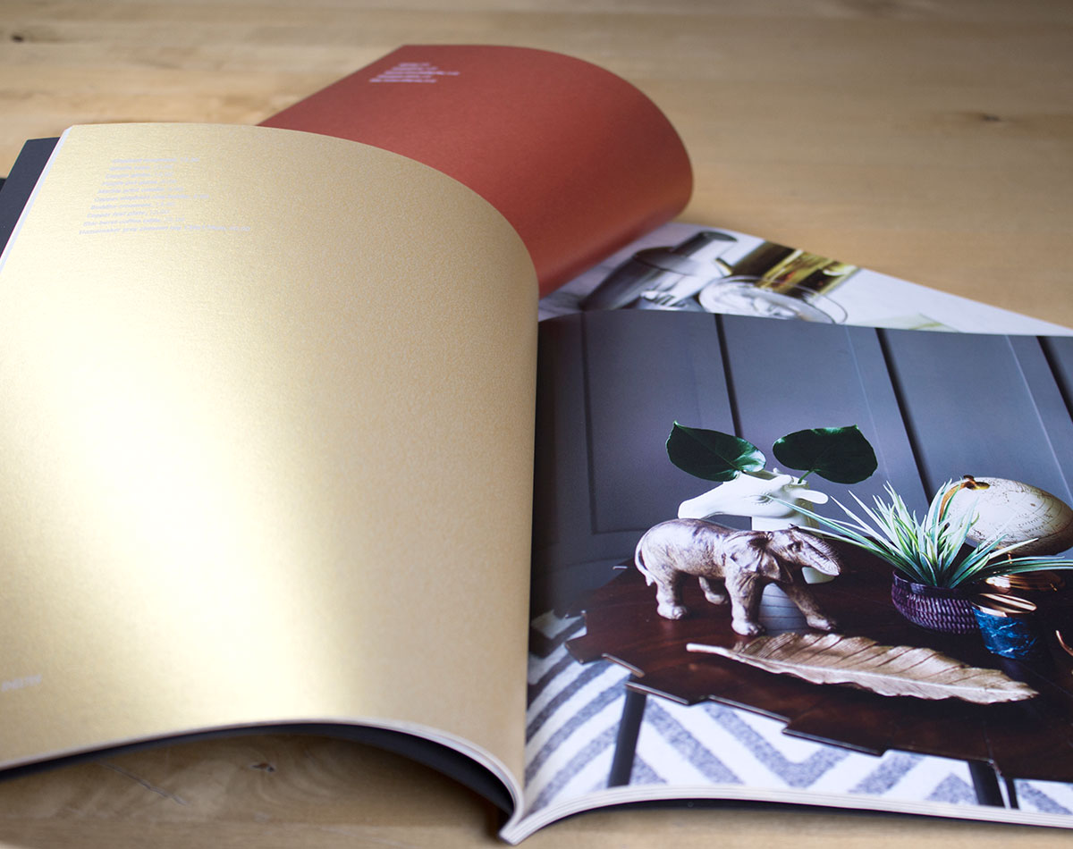
We kept the inner page design clean and modern with full page product images and room sets to allow the photography to create impact and work as hard as possible. We then split the range sections by adding an introduction page using a metallic paper called ‘Peregrina Majestic’ from GF Smith to match the cover colour. We printed black ink on these introduction sheets but allowed the marble effect to show the metallic paper through in gold, silver and copper making these in keeping with the overall colour themes.
The finished lookbook looked fantastic and was yet again received with high praise. The addition of having a choice of cover was also a nice feature and something that helped this seasons Lookbook to have extra impact, but more importantly it bolstered the reputation for each ASDA George Lookbook to have a new creative direction and a trend setting theme.
© 2026. we are CODA ltd: Creative Original Design Agency Leeds

