Logo Design
New Brand Development
Brand Guideline Document
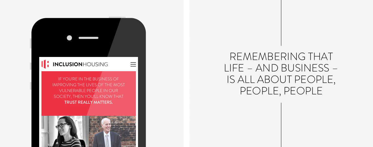
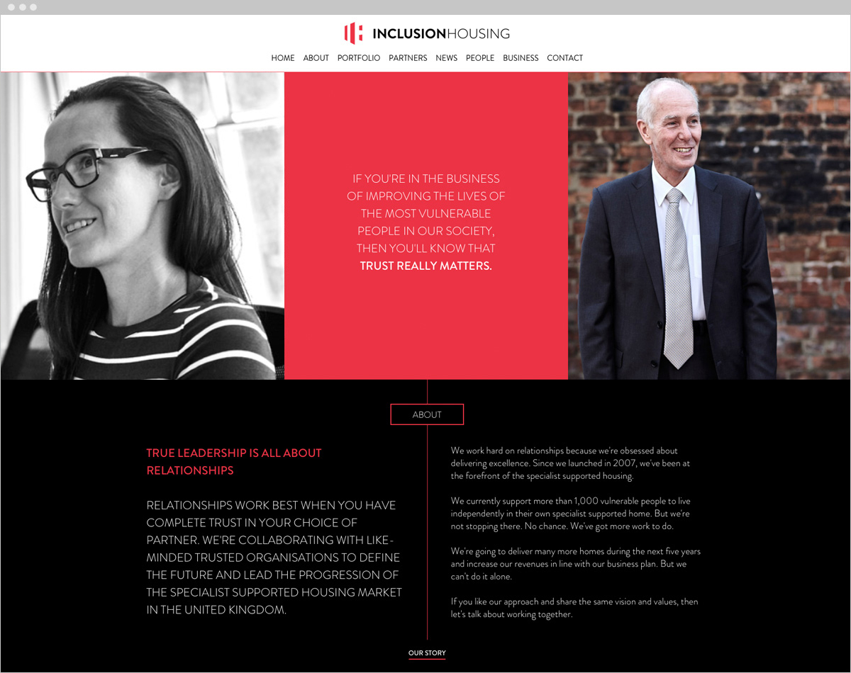
Fully Responsive Website
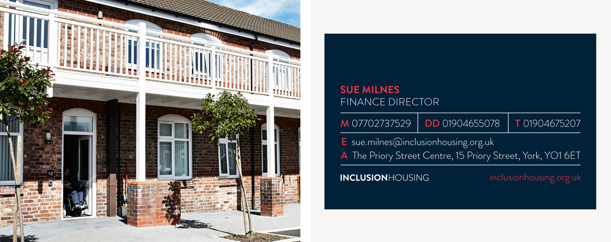
Stationery
Blog
Inclusion Housing aim to be the leading health and social care landlord for vulnerable adults; providing flexible, innovative housing solutions and life opportunities in collaboration.
Our brief was to create a strong and distinctive brand that would stand out from other market competitors. Inclusion Housing are highly focused on relationships, people and delivering excellence so the new brand and in particular the website, needed to show that.
Our first job was to create a range of ideas and logos that covered the brand messages that Inclusion Housing wanted to communicate. We explored various treatments of the initials ‘IH’ to create an abstract and modern look with a striking colour palette of coral red, navy blue, black and white. The colours we chose dovetailed in to their brand strategy, Coral communicating their different and dynamic yet modern approach, Navy communicating reassurance and safety whilst being corporate at the same time. The suggestion of property and housing was something we needed to include too, so by combining the ‘I and the H’ to form a monumental block shape we felt this gave the logo and architectural feel. It’s a strong, defined shape that’s abstract enough to work in a variety of ways.
The website needed to be clear to navigate and also reinforce the messages and business ethos that Inclusion Housing wanted to portray. We did this by separating out the home page into blocked sections which covered all these aspects; their people, their collaborative approach to business and the relationships with their properties and tennants.
For the next phase of this project we will be developing an extranet version of the site which will be used by all internal employees and management as a document library, news feed and company dashboard. We are also currently printing business cards and company stationery.
