
We were approached by Inclusion Housing to create a new brand for their company. Their offering was a unique one, to be the leading health and social care landlord for vulnerable adults; providing flexible, innovative housing solutions and life opportunities in partnership.
We were one of over a 100 agencies considered for this project, and we got down to the final 3. We then met with the board of directors and our website was a talking point and one of the reasons we were picked… not only were we seen as highly creative but we also had great, clean coding! Particular projects such as TING TING Fashion and Needle Boutique were examples of our creativity that they loved. Our meeting went well with them, discussing and brainstorming the values that make them stand out: Entrepreneurial, Inclusive, Excellence, Trusted and Collaborative.
Our next steps were to come back with creative concepts that we felt encapsulated their offering and values. We presented our concepts for the new brand in the final stage of the pitch and one of our concepts stood out above the rest and won us the project…
The Inclusion Housing symbol we created, portrays large structural objects or pillars suggesting buildings or housing in an abstract way giving a monumental look to the symbol which gives a solid and trustworthy feeling to the brand as well as communicating a growing, progressive and forward thinking organisation. The letters IH are subtly visible but are not obvious thus creating intrigue and a sense of hidden facets to the business.

The Inclusion Housing Wordmark uses an award-winning typeface Brandon Grotesque. This has a functional, clean and modern look without being too clinical, it therefore also has a slightly soft and warm background tone to the way it looks and this supports their brand values. Together, the Symbol and Wordmark create the Company Logo. It is the most significant feature for their message.

Colour, a primary means of visual identification can be used to create a powerful emotional response. The colours for the new brand were chosen with care to convey that Inclusion Housing are a bold, forward-thinking company (Coral) with a solid trust worthy backbone (Navy).
This project has now moved forward into creating a fully responsive website making it accessible on tablets and mobiles. Its unique, with a bold bespoke look. The website has recently been launched and we will be creating a full case study soon! As part of this, we commissioned a photographer to create a voice for the new brand. Here’s a snippet of the photography… Muted, sometimes black and white but always with a unique tone showing personality and character.
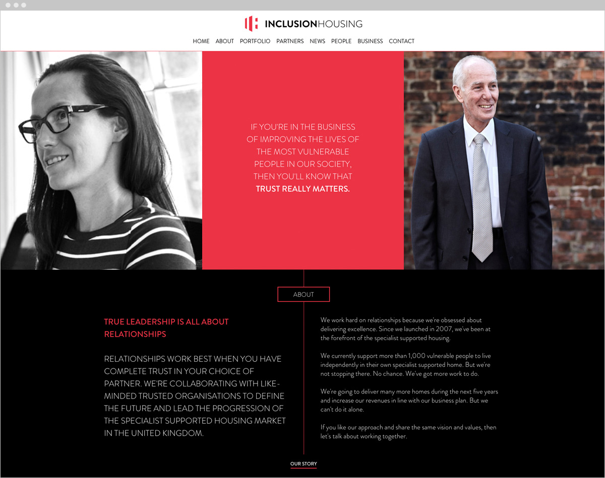
The new website can been seen here: http://www.inclusionhousing.org.uk
